Project overview
For a busy, frequently travelling family in a Roncesvalles century home, this project reworked the two rooms that mattered most day to day: the kitchen and the primary suite, plus a full flooring update to tie the flow of the house back together. The brief throughout was to modernize without losing the character that made the original home worth keeping.
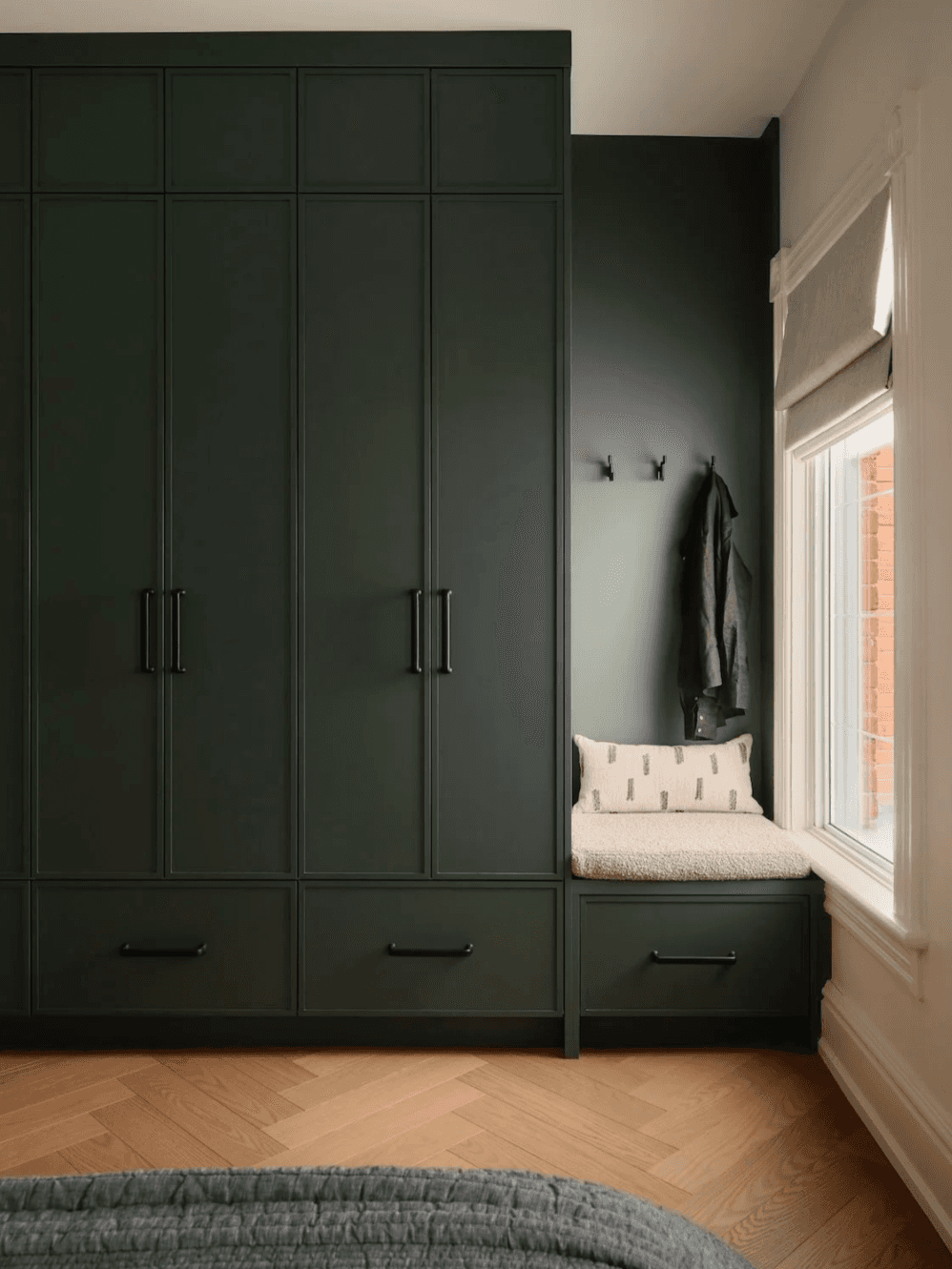
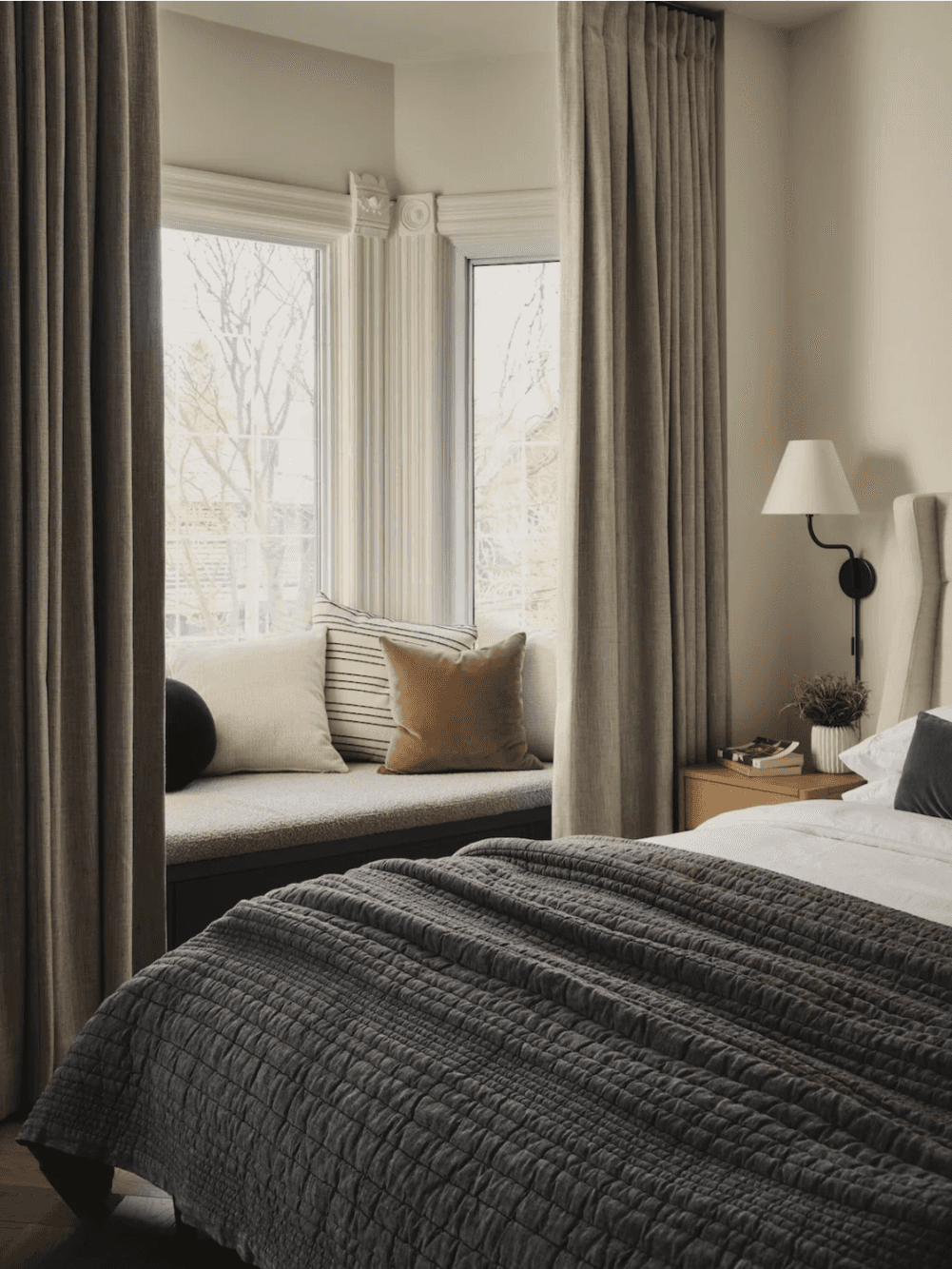
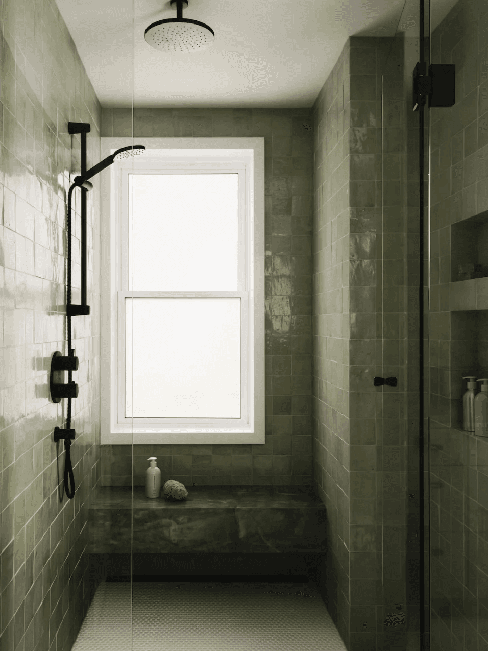
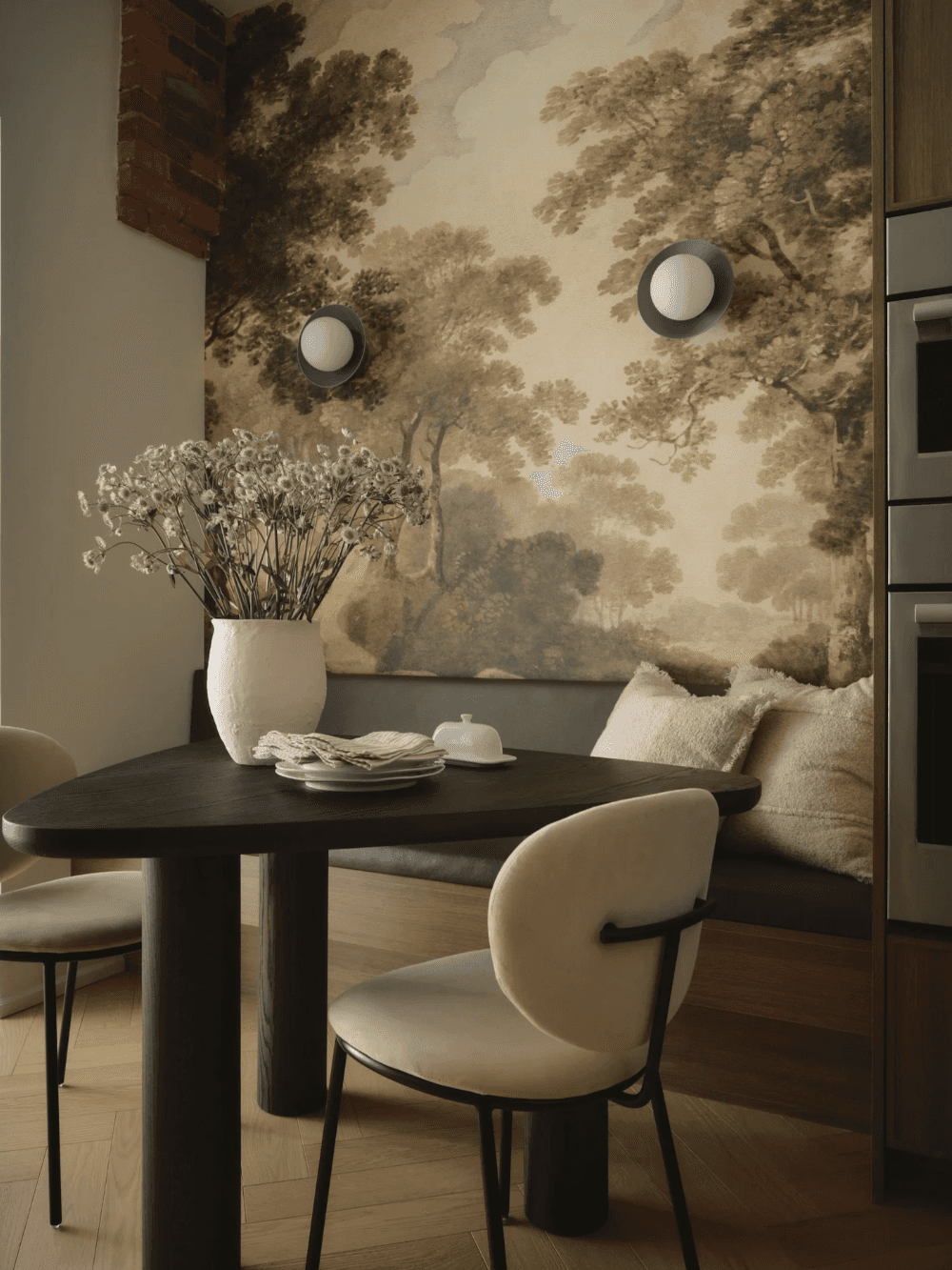
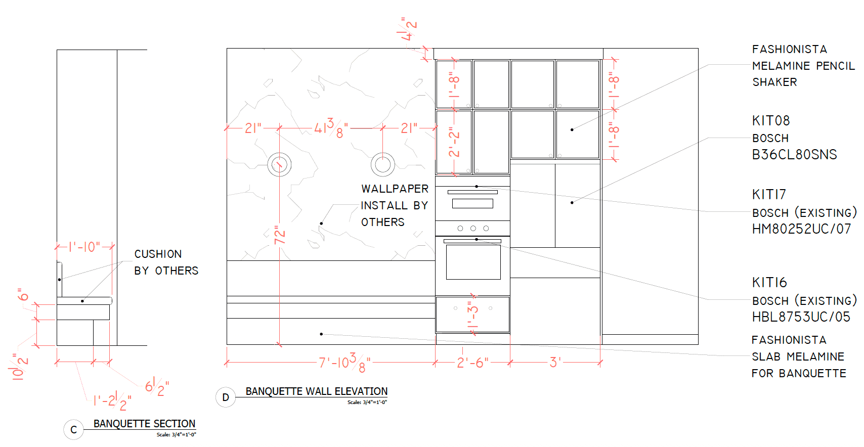
The kitchen centres on a custom-designed table and built-in breakfast nook; the kind of detail that only works if the bench height, table proportions, and the surrounding cabinetry are all drawn to fit each other exactly, since a nook built even slightly off feels cramped instead of cozy. In the primary suite, we transformed an unused bedroom into an ensuite with rich green zellige tile that anchors the walk-in shower and features a stone-topped double vanity. The bedroom itself was reworked around a window to create a custom seat and built-in wardrobe to create functional storage for each inch of the existing footprint.
Specifications
Location: | Toronto, ON |
Scope: | Kitchen, den, primary suite renovation + full flooring update |
Tools used: | AutoCAD & Canva |
My Contribution:
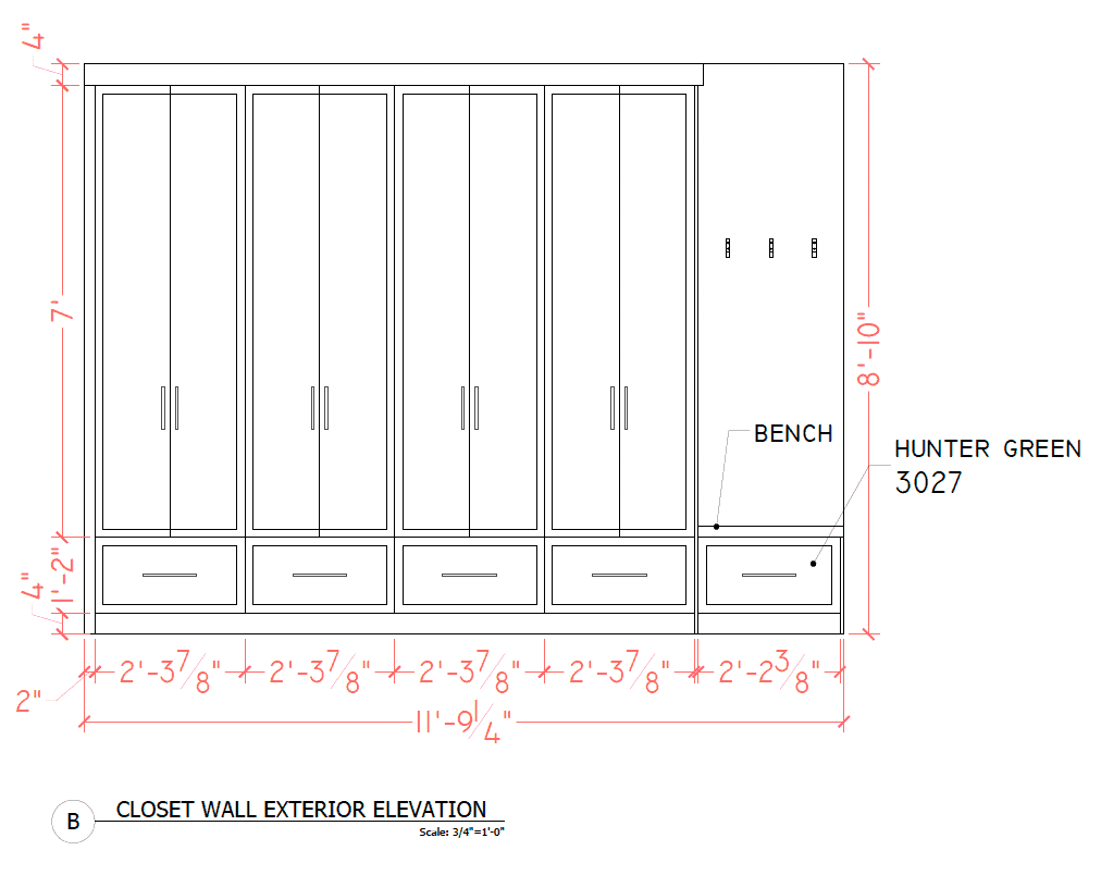
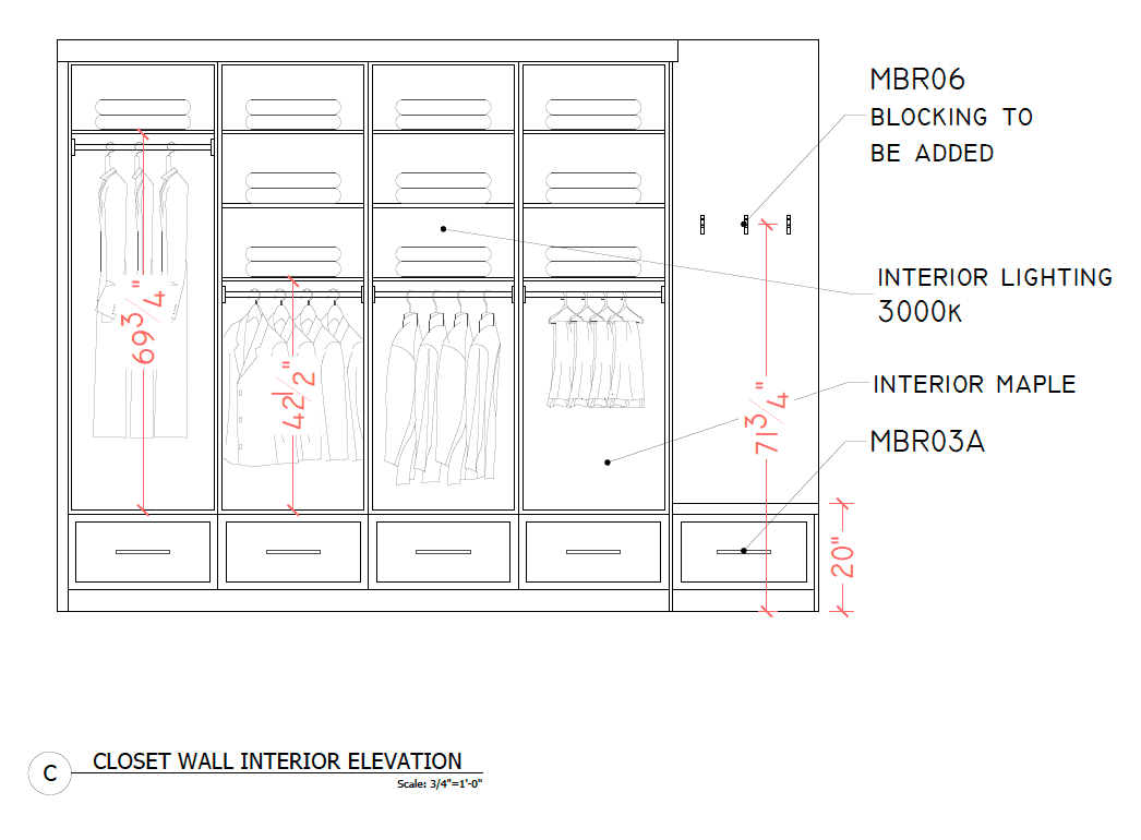
This one leaned more design-forward for me: I helped shape the custom breakfast nook concept early on, then drew it (bench height, table proportions, surrounding cabinetry) to make the idea actually work in the room once built. We designed the table as a custom piece to get the right look and exact proportions we needed to fit the space. Projects like this are why I've never loved a hard line between "designer" and "drafter." The nook wouldn't be right if either half had happened without the other, all about collaboration and building something beautiful clients can enjoy for years to come.
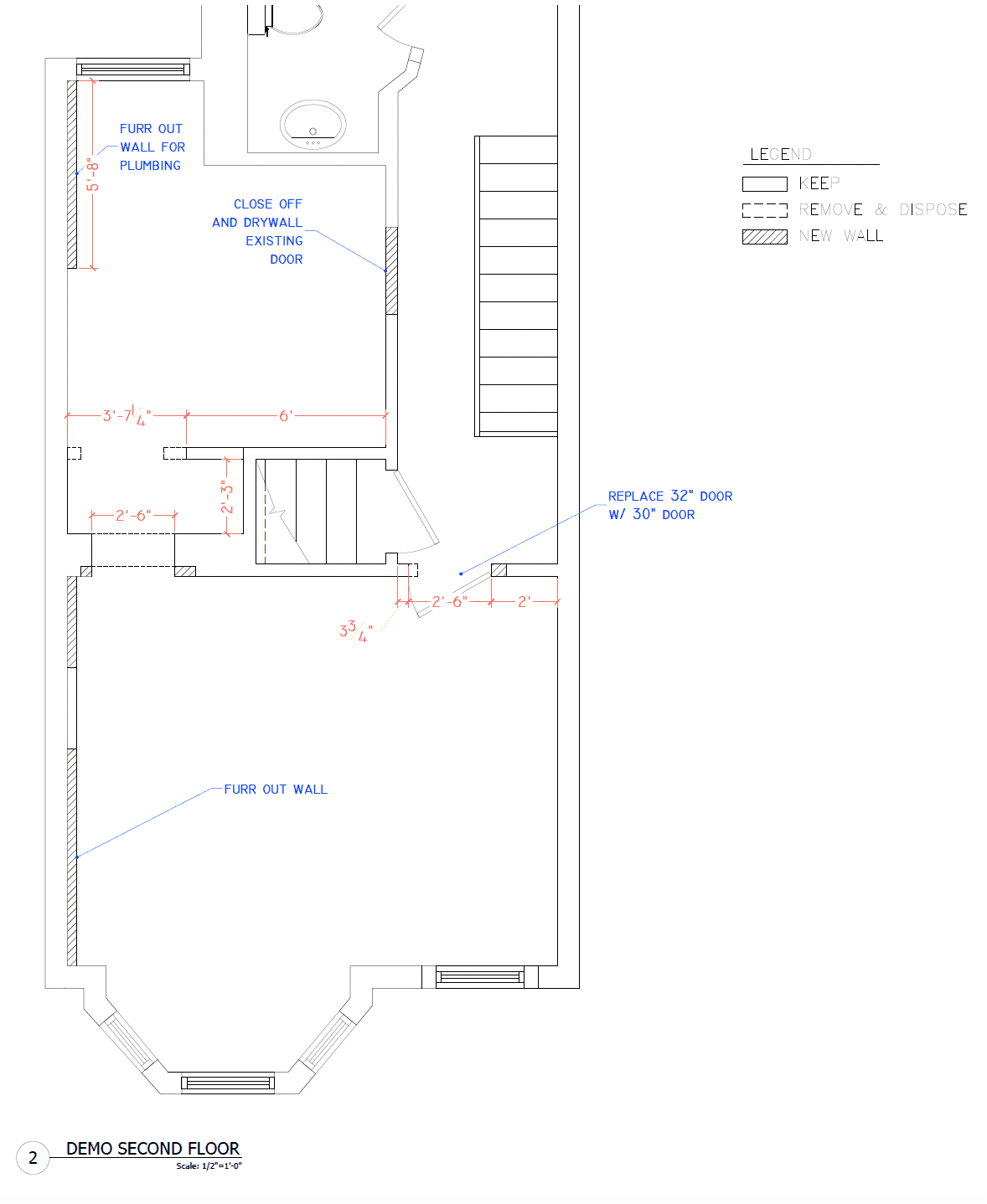
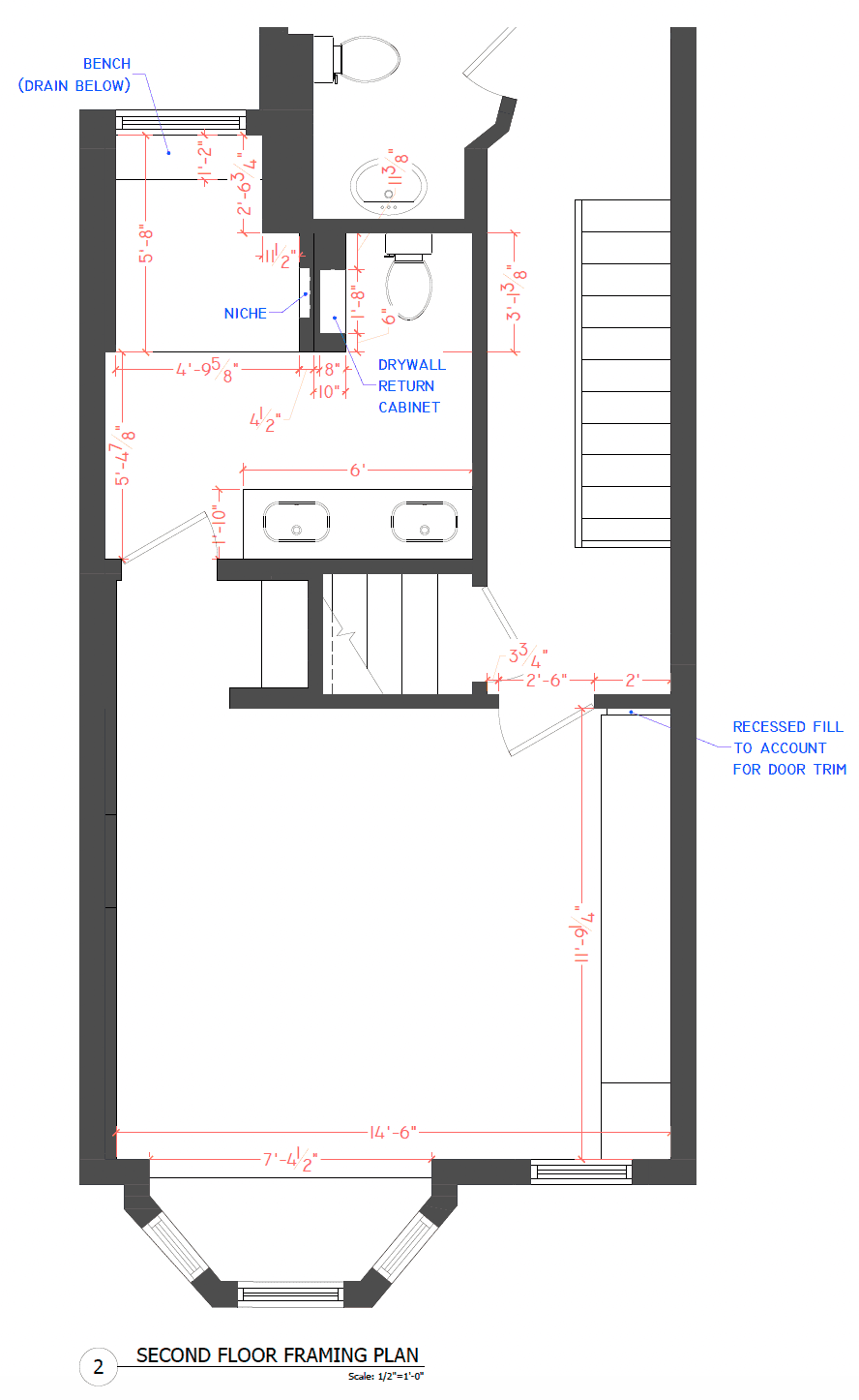
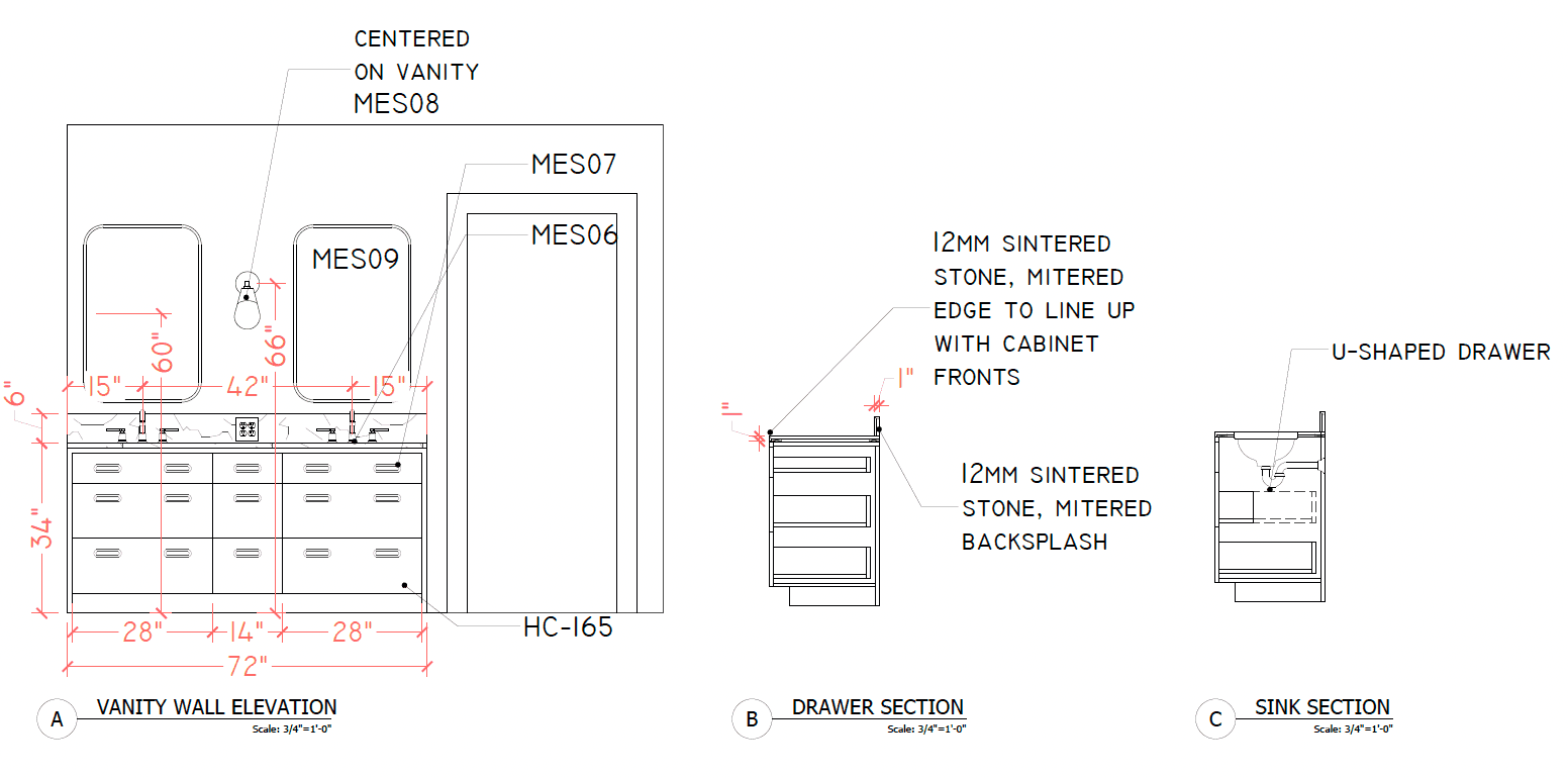
Sample of My Drawings:
Results
The breakfast nook does the thing built-ins are supposed to do and so rarely actually do: it doesn't just look good in photos; it's the spot this family actually sits every day because the proportions were worked out on paper before the bench was ever built. Same with the primary suite: the green zellige feels like a deliberate, calm retreat rather than a trend, because the layout around it (the vanity, the shower, the window seat) was all drawn to fit the room's real constraints, not just dropped in. The project was featured in Style at Home, but the compliment I care most about is that the family actually uses every space designed and expressed just how grateful they were and that living there is a pinch-me moment every day.
Designed by: Megan Crosbie Design
Photographed by: Patrick Biller